The demise of the surface weather / frontal map
UPDATE 8/28/2018: I originally neglected to add this link to WeatherRoanoke.com which has offered frontal maps for a decade, and will continue to, the site's author tells me.
UPDATE 4/3/2018: I have added additional links below to "automated" surface weather maps and have made new links to the EDD maps.
It's becoming harder and harder to find the classic "weather map," a.k.a. the "surface map," "frontal map," "pressure map," or "newspaper weather map." These maps typically show high and low pressure centers, frontal systems, and sometimes areas of precipitation or isobars (sample shown below).
The surface weather map is a uniquely human creation that computers can't duplicate. The tricky thing with the classic weather map is that the position of the fronts, lows and highs depends on the person who draws it, and computers can't give it the human touch that it needs.

My professor taught me this hand-drawn (i.e. pencil) skill in college. You start by drawing "isobars" to show lines of equal pressure, in-between the individual stations' pressure readings. Because there's a lot of distance between stations, the lines can vary, based on who draws them. Fronts aren't defined by specific meteorological values, but you typically use the isobars first, and the "kinks" in the isobars determine where the fronts are. Fronts are just boundaries of "different" wind directions and moisture (example hand analysis by Arizona.edu shown below).

Because of this, the best "surface maps" have to be drawn by hand (usually on paper first, by a meteorologist, then in Photoshop by a graphic artist). The process takes hours, and when you add regional, non-U.S., and other alternate maps like AccuWeather did, it takes hours to produce and the maps can change hourly.
In January 2017, AccuWeather discontinued what we called our public "surface map" because it's no longer in great demand. It was a tough decision to make... we had been drawing this map for the U.S. for more than 30 years. Here are the last two maps to be transmitted to the Internet:
The first is the 256-color "internet" version of our original 8-bit "television" graphic. The
If you still want to view a live "weather map" like this, alternatives are presented below.
1. AccuWeather's New Surface Maps:
While we don't do the "today's surface map" graphic anymore, any of the graphics contained in the weather news headlines on AccuWeather.com will contain the Jet Stream, low pressure areas, and areas of forecast precipitation when relevant. Here are a few examples:

The live map below will automatically update in this blog each day. It usually shows the weather a few days out.

2. Frontal Maps From Government Sources:
NOAA's Weather Prediction Center's website has a slew of frontal and surface weather maps. Perhaps their most impressive map is a zoomable, large high-resolution North American map.
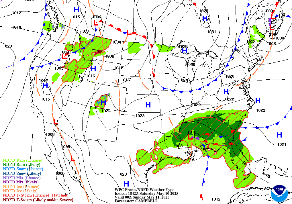
The map below is one of my favorites, adding areas of current (technically probably "recently forecast") weather (this is a live map).
<a href="http://www.wpc.ncep.noaa.gov/basicwx/92fndfd.gif"><img src="http://www.wpc.ncep.noaa.gov/basicwx/92fndfd.gif"/>
UPDATE 11/29/2017: NOAA's WPC has launched an experimental upgrade to their Day 1/2/3 forecast surface maps. The new maps look like this (this is a live map):
That's likely as close as we'll get to reproducing the original "newspaper" weather map.
What about outside the U.S.? Surface maps for
can be found at MeteoCentre.com. The UK Met Office also has some sharp-looking surface maps for Europe. Speaking of world-wide maps, NOAA's Ocean Prediction Center is still producing theirs, including a worldwide frontal map. They are centered on the oceans, but you get most of the continents too. This is their
with isobars, fronts, and pressure centers:
2: Automated Surface Maps From Other Vendors
You can attempt to have a computer draw a weather map (UNISYS has been experimenting with this for 20 years), but you typically end up with problems like this:

These types of automated maps can be obtained on the Internet at UNISYS, NWS, AMS, and at Intellicast here and here as well as on weather.com.
3. Zero-Hour Forecast Model Maps:
A less accurate but slightly-better-looking version of the "automated" surface maps can be achieved by looking at a "0 hour" model forecast map. When a computer forecast model is "run" on the computer, it ingests a database of current conditions called the "initialization" which is displayed as a forecast of what's happening right now.
The pro to this is that you have a nice-looking, computer-smoothed map; the cons is that the "initalization" can sometimes take several hours to ingest into the model, at which point it's out of date and it will not match a human-produced frontal map. Zero-hour forecast model maps can be obtained almost anywhere that forecasts are provided, but the one provided by NCAR also has the classic H/L/fronts.
4. Replacement Newspaper Weather Maps:
I received a request for the other day... a reader's son enjoyed the weather map included in the paper version of the Washington Post. Here's an example of what the map looks like:

(Newspaper weather maps look a lot different than Internet weather maps, because they are made for print. With the exception of subscribing to the newspaper online, you generally can't see these daily weather maps on their website).
If you're looking for more of a "newspaper look, in addition to the surface map links above, NOAA's EDD website allows you to customize and bookmark an interactive weather map on their website. Here's a sample:

In 2017 I'd designed a map via NWS EDD to most closely approach the newspaper weather map look, with some exceptions (sample shown above. The cool thing about the map being interactive, of course, is that you can zoom in and click on things for more detail.
The not-cool thing (as of 2018) is that you have to pick either Isobars OR Fronts, because the two don't match, mainly because the computer updates the isobars every hour but humans draw the fronts every 3 hours.

In 1972, AccuWeather signed their first television station into service, and all they had to use were hand-drawn, or magnetic-board-devised weather maps. When the newspaper USA Today launched in 1982, AccuWeather started production of the USA Today Weather Map on Macintosh computers. In 1987, AccuWeather launched the first computer-produced (human drawn) weather map, which you can see an example of in this video:

In 1989 we began transmitting 4-bit graphics (400x300 pixels) to TV clients, including a surface map, via computer modem. In 1990, these maps were available for the first time to users through the Prodigy, Compunet, and AOL dial-up modem services. AccuWeather's first website, AccuWx.com launched in 1996, featured these and other maps. Below is an example from 1998.
And the rest is history.
AccuWeather has also been producing maps showing the main jet stream and air masses for a long time, but I can't guarantee they'll be around forever. The "today" and "tomorrow' graphics are shown below, and will continue to update in this blog as long as they are available (edit: They were discontinued June 24, 2017. You can see the last map here).
You can also see the jet stream itself on many AccuWeather forecast maps, as noted in the "WHERE TO VIEW CURRENT WEATHER MAPS" section near the top of this blog... and you can get a map that looks like this from our Premium service (30-day free trial).
The jet stream is actually more complicated than this. What we show is the main jet stream for the given day. In reality, the Polar Jet stream is over the U.S. in winter, while the Subtropical Jet Stream arrives in Summer. Sometimes they almost merge. Below is a live image of the current jet stream from the SFSU, which also has worldwide jet stream images and forecast jet stream maps.
Report a Typo


